Frame Animation
Pros : easy set up, smaller file size, easier timing
Cons : limited animation, choppy animation
帧动画
好 :容易、文件容量小、帧时间控制较容易
坏 :有限的动画动作、生硬动画
After obtaining the needed animation from Timeline, it was exported into GIF file and open it in Photoshop again. Photoshop reads compiled animated GIF file as one frame per layer. Because Timeline used frames per second timing method, the same static action could take 10 frames, and this is where it builds the enormous file size.
从时间轴得到了所需的动画之后,输出GIF文件然后再用Photoshop打开。Photoshop把动画GIF文件读成一帧一层。由于时间轴用的是一秒几帧,同样静态的动作可能用上10帧,这就是它如何达到如此巨大的容量。
Frame Animation used seconds per frame, I delete the repeated frames and readjust the timing on a few frames where I figure the frames should move faster. As a result, the frames is reduced, and file size shrink.
帧动画用的是一帧几秒,我删除了重复的帧还有调整一些我认为应该动得更快的地方的时间。结果,减少了帧的数量和文件的大小。
---
Medium 媒介: Digital 电脑
Tool工具 : HP Pavillion, 64-bit Vista, 4gb DDR3, nVidia Geforce GT120, WACOM Intuous 3.
Programme 软件: SAI彩, Adobe Photoshop CS6
i·DeA
This is my Work In Progress Showcase.
这是我的绘画过程纪录。
这是我的绘画过程纪录。
Friday, May 31, 2013
Friday, May 24, 2013
Chocoholic Badge - Timeline Animation
Timeline Animation
Pros : Zoom animation, rotate animation, smoother animation, easy tweening, more file types
Cons : complex, big filesize
时间轴
好 :大小动作、旋转动作、动画顺畅、自动动画、多种文件种类
坏 :复杂、文件容量大
As can see the set up for timeline are rather complex with multiple layers and groups. Layers and groups are supposed to assist in separating items to make them easy to work with individually, but when they were 'overused' they start to pile up and become very complex.
如所看到的,多层图层和图组的组合造成相当复杂的流程。图层和图组本来应该以分开东西来让它们容易个别处理,但是当‘过份使用’時,它们会开始堆积起来变得非常复杂。
The timing they use are fps frame per seconds, as in how many frames in a second. This ensure smooth animation and the cause for huge file size.
时间轴的时间用的是每秒多少帧,亦是在一秒内有多少帧。这功能保证顺畅的动画和导致巨大的文件量。
Keyframes is important theory in timeline animation. On the left panel, notice the small diamonds shapes, they are keyframes. The idea of keyframes is to have a head and tail, then the tweening will generate the body, instead of you moving every frames. Every diamonds represent an important change of animation.
关键帧在时间轴动画是个非常重要的理论。在左边的时间轴窗,注意那些小小的钻石形状,它们就是关键帧了。关键帧的要点就是有头和尾,之后自动动画就会推断出身体,那你就不用调整每个帧了。每个钻石代表重要的动画变化。
---
Medium 媒介: Digital 电脑
Tool工具 : HP Pavillion, 64-bit Vista, 4gb DDR3, nVidia Geforce GT120, WACOM Intuous 3.
Programme 软件: SAI彩, Adobe Photoshop CS6
Labels:
§ ~ Animation,
† ~ Digital,
6 ~ Animate
Sunday, May 12, 2013
Chocoholic Badge - Animation
I had just completed an animated raster art on April, 2013 as my signature for a certain website, www.menewsha.com.
4月2013年,我刚完成了一幅会动的图来当某个网站的签名,www.menewsha.com。
There are more than one way to animate it, the method I use is to have items on different layers. Before I draw, I plan out the animation I wanted to do.
1. Blink
2. Tilt head
3. Lick
4. Wink
5. Thumbs up
After listing out what you want to do, you can pick out the items that have to be in their own layers. Eyes, if wink, both eyes have to have different layers. Head one group, arm one group and tongue another layer. Head would be a more complex structure as it also affect the eyes and tongue.
动画有多过一种做法,我所用的方法是将每个动画部分分去不同的图层。还没有开始画之前,首先列出我想要做的动画。
1· 眨眼
2· 歪头
3· 舔
4· 眨单眼
5· 竖指
列出了想弄的东西,就可以挑出必须分别图层的东西了。眼睛,如果是眨单眼,双眼就必须有各自不同的图层。头一组、手臂一组还有舌头一层。头部会比较复杂因为它也会连带影响眼睛和舌头的动画。
I use Sai to draw the lines and then using Photoshop to fill in the colours plus shading it. As it will be a gif, I only use 2 tone shading, as in only 2 shades.
我用彩绘图之后用Photoshop上色和润色。因为它最后会是gif图,所以我只用两色调,就只有深浅。
Photoshop CS6 have two types of animation, Timeline and Frame. Frame was there ever since... I think maybe CS2... anyway, it was there for a long time, I used Frame animation for a few animations before. Timeline on the other hand is a new addition inside Photoshop, the method was a bit different from Frame, but it is very close to Flash.
Photoshop CS6有两种动画,时间轴和帧动画。帧动画自从……我想应该是CS2的时代就有了……无论如何,总之很早以前就有了,我之前还曾经用过帧动画几次。反之时间轴就是比较新的工具,方法不同于帧动画比较接近Flash动画。
Because of the new addition of Timeline, it vastly improve on the animation action you can do. Previously, Frame only supported move and transparency, now Timeline also support rotate, zoom and so on. If not because of Timeline, I won't be able to do the tilt head motion as it involves rotation.
因为新加入的时间轴,它大幅度地改进你可以做的动画类型。之前,帧动画只能弄移动和不透明的动画,现在时间轴还可以弄旋转、大小等等的。如果不是因为时间轴,我可不能弄歪头的动作因为歪头需要旋转的功能。
First, I use Timeline to animate the actions I want, then I change to Frame to adjust the timing. I will go into deeper details about each animation methods.
首先我先用时间轴弄出我要的动作,之后我转去帧动画来调时间。我会再更深入的分析各个动画作法。
---
Medium 媒介: Digital 电脑
Tool工具 : HP Pavillion, 64-bit Vista, 4gb DDR3, nVidia Geforce GT120, WACOM Intuous 3.
Programme 软件: SAI彩, Adobe Photoshop CS6
Thursday, May 9, 2013
Snappy the GNAW - Comic
Coursework Condition:
1. 3 - 5 pages.
2. Setting must be in or around a certain building.
Please Enjoy.
课业的条件:
1. 三至五页。
2. 背景必须在某个建筑内、四周。
敬请观赏。
1
2
3
~ The End ~
Medium 媒介: Traditional传统
Tool工具 : Paper纸, Tracing Paper透写纸, Blue Lead Pencil蓝铅笔, Sakura Micron Pen樱色代针笔 0.05, 0.1, 0.3, 0.5
Labels:
§ ~ Comic,
† ~ Traditional,
∞ ~ Showcase
Wednesday, May 8, 2013
Snappy the GNAW - Cover
COVER 封面
It is......ugly.
The scanner pick up allll the marker pen streak!
好……难看。
扫描仪很~仔细地把麦克笔的笔触完全扫出来了!
Snappy's pose, costume and gun are inspired by Men In Black show. Isn't he cool?
小咬的姿势是从黑超特警组抄来的姿势、衣物和枪械。很威风吧?
---
Medium 媒介: Traditional传统
Tool工具 : Paper纸, Tracing Paper透写纸, Blue Lead Pencil蓝铅笔, Sakura Micron Pen樱色代针笔 0.05, 0.1, 0.3, 0.5, Shin Han Touch Markers麦克笔
Labels:
§ ~ Comic,
† ~ Traditional,
∞ ~ Showcase
Monday, May 6, 2013
Snappy the GNAW - Characters
Coursework required to complete character sheet, I have one main, one supporting and a dozen of extras. Consideration for the character sheet follow the needs of story and specially tailored for main character's perspective. First there are front, side and back view, due to it being a short story therefore name and information are pretty basic, zoom in detail, colour palette and expression. Because extras are a complete different animal and not having such important role the information part is cut short, also to match the perspective of the mouse the focus was directed onto the feet.
课业规定必须做角色设计,我一共有一个主角,一个配角和一堆路人。角色设计的考量依照故事的需要和主角的视角而特别设计。首先有正,侧和后面,因为是短篇故事所以名字和资料都是很基本的,特征放大,颜色盘还有表情。路人因为是完全不同的生物而且并不大重要所以资料上并没有那么详细,而且还为了配合老鼠的角度而特别注重脚部。
Medium 媒介: Traditional传统
Tool工具 : Paper纸, Tracing Paper透写纸, Blue Lead Pencil蓝铅笔, Sakura Micron Pen樱色代针笔 0.05, 0.1, 0.3, 0.5, Shin Han Touch Markers麦克笔
Labels:
† ~ Traditional,
0 ~ Character Sheet
Sunday, May 5, 2013
Love Theorem Pythagoras - Special Effects
An art contest entry for gaiaonline.com. Derek, Jace & Amilia are characters belong to owner of the contest.
给盖亚天空的绘画比赛作品。德雷克、杰斯&阿美莉雅是属于比赛主办者。
These screenshots showed that how I arranged all different colours into different layers with utmost patience, just for the sake of convenience of correction and making special effects, after all it is easier when it were all separated from the beginning than have to separate it after the colours are merged together. The dark blue organza was amongst the first being adjusted to lower its opacity for the transparent effect, because plum flower's stamen details are small so it was drawn straight with colours without lining. Lastly the shadow and highlight was also adjusted, I used 4 tools, each can achieved similar effects, depending on which you are familiar with.
这些截图有显示我如何不嫌烦的把每个颜色都放在不同的图层,就为了方便更改和弄特效,毕竟一开始就分好的话比之后分开容易得多。首先调整的有一层半透明的深蓝色网纱,梅花的花蕊因为细小所以不必描线直接用颜色画上。最后还调整了光影的深度,我所用的工具有四种,每种都能达到类似的效果,端看你比较熟悉哪个。
To match the colour of the plum flower, shiny little beads were added on the dark blue organza, this further compliments the plum flower's existence. At the same time, I didn't forget to add a shine on Jace's white teeth. After that I felt that the two guy's tuxedo seemed to be too smooth, so I added texture on Derek's jacket who was also the one at front. Lastly, although it is not noticeable, I have added moon light shine on top left corner.
为了配合梅花的颜色,深蓝的网纱还镶上了点点闪烁的珠子,更加凸显出梅花的存在。同时也没有忘记把杰斯的白牙弄闪。之后察觉两个男的西装都太柔滑了,就把最前面的德雷克衣物加上不同布料的质感。最后,虽然不容易察觉,左上方还画上了月光光线。
Mark, Finish!
上印,完成!
---
Character 人物: Derek, Jace & Amilia 德雷克、杰斯&阿美莉雅
Medium 媒介: Digital 电脑
Tool工具 : HP Pavillion, 64-bit Vista, 4gb DDR3, nVidia Geforce GT120, WACOM Intuous 3.
Programme 软件: SAI彩, Adobe Photoshop CS3
Contrast
Image -> Adjustment -> Brightness/Contrast
Image -> Adjustment -> Levels [ctrl] + [L]
Image -> Adjustment -> Curves [ctrl] + [M]
Image -> Adjustment -> Hue/Saturation [ctrl] + [U]
Texture
Feather -> Pattern Overlay
Blend Mode : Colour burn
Opacity : 10%
Saturday, May 4, 2013
Love Theorem Pythagoras - Shade
An art contest entry for gaiaonline.com. Derek, Jace & Amilia are characters belong to owner of the contest.
给盖亚天空的绘画比赛作品。德雷克、杰斯&阿美莉雅是属于比赛主办者。
This time, I tried another approach in shading the shade colour. Instead of pure black/gray low opacity, I tried using a dark purple with low opacity. For highlights, instead of pure white low opacity, I tried to use the lighting colours, which is yellow in low opacity. As for the hair, the description is having strands of red and yellow highlights not clumps of hair, so extra lines are sketched on to represent it.
这次,我在调色颜色选择方面做了另一种尝试。我用低不透明的深紫色来上阴影而不是低不透明的纯黑或灰色。至于光亮方面,我试用灯的颜色,也就是低不透明黄色来打光。至于头发,形容上是丝丝的红黄染发而不是撮,所以多画了线条来表现染发。
I quite like how purple shadow and yellow highlight work in this setting. To match the background soft style, instead of celshade, the shades are not sharp edged, but in soft brush stroke.
我非常满意深紫阴影和浅黄打光在这背景的效果。为了配合背景的柔和风格,色调边缘并不清晰,使用的是柔和的毛刷笔触而不是卡通渲染法。
---
Character 人物: Derek, Jace & Amilia 德雷克、杰斯&阿美莉雅
Medium 媒介: Digital 电脑
Tool工具 : HP Pavillion, 64-bit Vista, 4gb DDR3, nVidia Geforce GT120, WACOM Intuous 3.
Programme 软件: SAI彩
Friday, May 3, 2013
Love Theorem Pythagoras - Color & Background
An art contest entry for gaiaonline.com. Derek, Jace & Amilia are characters belong to owner of the contest.
给盖亚天空的绘画比赛作品。德雷克、杰斯&阿美莉雅是属于比赛主办者。
I can't forget what a joke I made by mixing up Derek and Jace's Hair style. XD All the information are correct, but somehow the hairstyle got mess up. I quickly go and adjust the mistake.
我不能忘记我闹了什么笑话,竟然将德雷克和杰斯的发型搞错了。XD所有的资料都没错,但是不知怎的就发型搞错了。我赶快跑去订正错误。
My habit of coloring have to start with having all base colour fill in according to their shapes precisely from the beginning. At that time, I haven't figure out the easier way to fill in colours for SAI, so I switch to Photoshop just to fill in the colours.
我上色的习惯是从一开始就必须根据形状先上基本色。那时候,我还没有在彩内研究出如何比较容易上色的方法,所以转去Photoshop就为了填色。
1. Select using Lasso/Magic Wand.
1. 用Lasso/Magic Wand圈选。
2. Expand the selection by 1 or 2 or any size of pixel depending on how thick your line is.
2. 根据线的粗细,扩充圈选大约1或2或任何数量的像素。
3. Fill in colour.
3. 填色。
Magic Wand is a very convenient tool to select the area as it did most of the selection for you, depending on the Magic Wand Tolerance, selection line might not reach the centre of the line. It would look ugly if the colour is not filled up to the centre of the line as it would appear that there are black and white lines around each colour shapes. That is why Step 2 is needed to expand the selection line to reach the center of the line.
Magic Wand的确是个对圈选任务非常方便的工具因为它自动帮你圈选任何形状,根据Magic Wand Tolerance的设定,圈选线可能没有达到线中间。如果就这样上色的话会变得很难看,因为每个颜色块都会被一层白一层黑的线包围着。为了将圈选线达到线中间的所以第2步的扩充圈选是必要的。
After filling in colours, it is time to shade it. Unusually, this time I decided to start with background. As mentioned before, the art setting was in a ballroom kinda old Europe ballroom feel. To match that atmosphere, I attempted a painting effect imitating the old art traditional style brush strokes. As can see on the curtain, I tried to brush it so simulate fabric. But the background is different, I used a cross tip brush and just squiggle in small circles around everywhere, kind of Van Gogh strokes inspired.
填完色之后,润色时间到了。稀奇的,这次我打算从背景开始。如之前提过,故事背景处在拥有旧欧洲风的舞厅。为了配合那样的气氛,我尝试了模仿旧画传统派的手法。就如图上显示的布帘,尽量用笔刷把布料表现出来。可是背景就不同了,我用十字笔尖形的笔刷在四周画上小圈圈,类似梵高的风格。
---
Character 人物: Derek, Jace & Amilia 德雷克、杰斯&阿美莉雅
Medium 媒介: Digital 电脑
Tool工具 : HP Pavillion, 64-bit Vista, 4gb DDR3, nVidia Geforce GT120, WACOM Intuous 3.
Programme 软件: Adobe Photoshop CS3, SAI彩
Base Colour
Lasso Tool [L]
Magic Wand [W]
Select -> Modify -> ?pixel
Edit > Fill [Shift] + [F5]
Background
Brush
Tip shape 笔尖形 : cross 十字
Labels:
† ~ Digital,
4 ~ Color,
5 ~ Background
Thursday, May 2, 2013
Love Theorem Pythagoras - Line
An art contest entry for gaiaonline.com. Derek, Jace & Amilia are characters belong to owner of the contest.
给盖亚天空的绘画比赛作品。德雷克、杰斯&阿美莉雅是属于比赛主办者。
Look at the date watermark over the WIP... I have screen capture the WIP when I was doing it and the particular case that I am not motivated enough to put it up on the blog. Like... little bit more than 2 years ago, so not surprisingly, I forget most of the details.
瞧瞧截图水印上的日期…绘画的时候截的图,由于动力不足而没有放上网志的其中之一。好像…超过两年了,就算忘了过程的点滴也不奇怪。
I have the habit of organizing layers, so I started off creating folders for each characters. For lining, I use the Vector Layer, because vector uses path which can be edit later easily, so I do not need to keep erase and redraw the curve I want to achieve. I find it easier to work with points, besides, it is also easier to select even they mesh in the same layer. Conclusion is, the vector layer allows adjustment and flexibility.
我有把图层排列好的习惯,所以一开始就为每个角色列出文件夹。构线的话,我用的是矢量图层,因为矢量图层使用可以在之后容易调整的线稿,那样的话我就不必一直擦掉和重新描出我想要的曲线。我觉得矢量点很容易掌握,而且就算在同一个图层也比较容易圈选。总之,矢量图层允许调整性和通融性。
SAI Vector Layer have more advantages than Photoshop. You can freely adjust the pressure of each point and easily drop the weight on each line. I divide layers according to line thickness, generally I use 0.3 and 0.5 thickness. It also have different edge shape to select depending on how sharp you want your line look.
彩的矢量图层比Photoshop备有更多好处。你可以随意调整每个矢量点的笔压和更改线条的粗细。我根据线条的粗细来分开图层,通常使用0.3和0.5。它也有不同的线边缘形可以选择,但看你需要多清晰的线条。
After tracing the lines of each character, fixing a few mistakes on the way as you can see the final black line do not follow closely to the blue sketch at some places in the above pictures. Then I adjust the height the pair of boy and girl at the back. As the boy seem to be taller according to the character biography.
将每个角色描完线之后,过程中也顺便修改了一些差错,如以上所有的截图显示,并不是每条黑线都紧跟蓝线。然后我调整了后方两个男女的高度。根据人物介绍那男的似乎比较高。
Line Stage, Finish!
描线阶段,完成!
---
Character 人物: Derek, Jace & Amilia 德雷克、杰斯&阿美莉雅
Medium 媒介: Digital 电脑
Tool工具 : HP Pavillion, 64-bit Vista, 4gb DDR3, nVidia Geforce GT120, WACOM Intuous 3.
Programme 软件: SAI彩
Vector Layer矢量图层
Pen 笔
Pen Edge 线边缘形 : 3
Pen Thickness 笔的粗细 : 0.3 & 0.5
Colour 颜色 : # 000 000
Wednesday, May 1, 2013
M.B.A Menewsha Bishie Alliance - Showcase
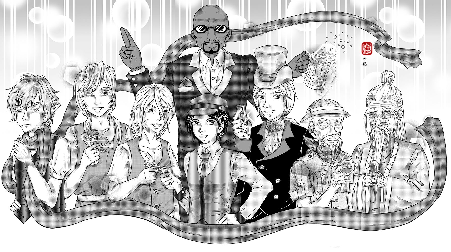
A commission for menewsha.com. Menewsha Bishie Alliance (M.B.A) are official Non Playable Characters (NPC) in menewsha.com. Cain/Abel, Nalin, Nami, Magnus, Lance, Mr. Mayor, Jeryk and Toymaker.
给menewsha.com的委托绘画作品。Menewsha美男子联盟是menewsha.com官方人物。凯因或亚貝尔、纳林、纳米、麦葛那斯、岚斯、市长先生、杰力克、玩具家。
Had not been very productive in the last few years after making the blog, been busy with university and what not. Which a few projects are abandoned due to not enough time or motivation at that time. Even though when I am productive, have completely forgotten about the blog. XD
自从制造了网志,为了大学类似的事情变得非常忙碌导致近几年来没有作出任何作品。同时也因为时间与动力不足而放弃了一些计划。就算偶尔完成了作品也把网志给忘掉了。XD
It had been a long while since I update this blog, so I decided to start off with a smashing group art. Unfortunately, this time I don't have the progression pictures as I work in different medias for this group art. I will still try to cover all phase shortest as possible.
离上次更新已经很久了,所以决定用闪耀的团体图来开场。可惜的是,因为这次绘画传统电脑并用所以没有收录过程截图。我还是会尽量以最短的文字来解释每个阶段。
1. Preliminary Phase - Planning
Actually the same steps taken for planning in the post July 27th, 2010 - Heirs to the Legend - Preliminary Planning, 2010. Refer to that post, unfortunately, one of the project that I abandoned.
1. 预备阶段 - 计划
其实利用了曾经写过的27日7月2010年 - 传说的继承人 - 预备计划类似的方法。参考那篇,不幸的,是被放弃的绘画之一。
2. Executing Phase - Sketch
It started off simple circles, and decide their poses that match their personalities. This time I do it with paper and pencil.
2. 执行阶段 - 草图
用简单的圆形开始,决定每人的姿势务必配合人物的性格。这次我是用铅笔画在纸上。
3. Executing Phase - Line
I originally ink it by pen, but when I scanned in, I felt that the lines are really bad. As a perfectionist, I retrace all the line digitally in SAI. Whilst fix a few mistakes on the way.
3. 执行阶段 - 构线
我原本打算只是用构图笔的,可是扫描进去之后,觉得线很难看。身为完美主义者,我重新在电脑用SAI描线。同时也趁机修改了一些错误。
3. 执行阶段 - 构线
我原本打算只是用构图笔的,可是扫描进去之后,觉得线很难看。身为完美主义者,我重新在电脑用SAI描线。同时也趁机修改了一些错误。
4. Executing Phase - Tone
Took me some time to find the appropriate tones for each section. I use Manga Studio to fill in the tones. They have a library of special tones that I find useful. Then I export it over to Photoshop to shade. Not much tips other than balancing the screentone type and beware of the clash of too MANY patterns.
4. 执行阶段 - 网点
我用了很久的时间来为每个部分寻找适合的网点。我用Manga Studio来贴网点。它拥有一拖拉库我认为很实用的特别网点。之后传进Photoshop来上光影。并没有什么特别的捷径除了平衡网点类别和注意别利用太多不同的花纹。
---
Character 人物: MBA 美男盟
Medium 媒介: Pencil铅笔, Sakura Micron Pen 樱色代针笔0.1,0.3,0.5, Digital 电脑
Tool工具 : HP Pavillion, 64-bit Vista, 4gb DDR3, nVidia Geforce GT120, WACOM Intuous 3.
Programme 软件: SAI彩, Manga Studio EX4, Adobe Photoshop CS6
Tool工具 : HP Pavillion, 64-bit Vista, 4gb DDR3, nVidia Geforce GT120, WACOM Intuous 3.
Programme 软件: SAI彩, Manga Studio EX4, Adobe Photoshop CS6
Labels:
§ ~ Art,
† ~ Digital,
∞ ~ Showcase
Subscribe to:
Comments (Atom)